One of us! One of us!Agreed. I think I'm going heel mode and will fully embrace the change. Love the new logo... LOVE IT!
You are using an out of date browser. It may not display this or other websites correctly.
You should upgrade or use an alternative browser.
You should upgrade or use an alternative browser.
News New Mason Athletics Logo Coming Soon?
- Thread starter The Great PATSby
- Start date
The M represents our win percentage chance under Hewitt in the second half of games.Assuming the outside line will be used as an outline, it looks more like "q m".
Even not so bright vcu fans will be able to come up with a chant using the Q.
And the "M" looks like we flatlined.
Holy shit, we are going to be known as the Dead Queens (or something similar)!
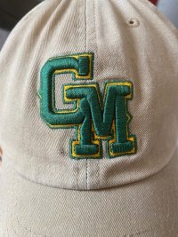
View attachment 2258
Old fart prefers logo that reminds him of learning to write as a child, news at 7.Yes, the GM on the baseball caps are not attractive at all. Too "skinny."
So then everyone will suck together.
I thought the same thing...Maze. Puke.
PLEASE be right!!!
M and Quill. My favorite.
Please give us a GMU for sports!!
thebiasedannouncer
Sixth Man
I for one like the new logo...
One word: UGH
Agreed, it doesn't.My biggest complaint is the forced fusing of the G into the M. Why do that? That never looks good. And especially when the two letters don't lend themselves to doing it. And, no, the baseball GM doesn't look good either.
This looks like an athletics logo. Looked great on the goal pads, would've looked great at center court. Fantastic for merch. Could it have been cleaned up a bit, sure, but everything that was needed was there.
I am disappointed that it was never given its chance to shine as the primary athletics mark.

I am disappointed that it was never given its chance to shine as the primary athletics mark.
Agreed. I think I'm going heel mode and will fully embrace the change. Love the new logo... LOVE IT!
As a well-compensated word salad maker, I can see this one coming a mile away.I hope that those involved explain their thought process and ultimate decision.
By George.
Starter
A10talk is ran by nerdy kids. That bracket buster account has like 1,000 followers and who GAF what RamNation says? They haven’t been relevant in years.Even Bracket Busters and A10 Talk have weighed in on X.
Lots of people are making fun of it.
EDIT: VCURamNation is talking about it now.
I understand not liking it, but the public whining on Twitter is embarrassing.
I like the new logo but you're spot on here...this was already in use and looks great. Could have saved a lot of money by just rolling with this.This looks like an athletics logo. Looked great on the goal pads, would've looked great at center court. Fantastic for merch. Could it have been cleaned up a bit, sure, but everything that was needed was there.
I am disappointed that it was never given its chance to shine as the primary athletics mark.
At the same time looks like they wanted a full university rebrand vs. just one for athletics...that means they'd have to move away from this one since it's already got associations elsewhere.
I think once the full color new logo plus all the additional branding gets revealed people will pipe down. It's not going to be in black and white and there is more to a rebrand than just a logo.
To your point, the design element that I like most in the rebrand is not present in the black and white version. It's a shame that everyone's first impressions are being drawn from something less than the full product.It's not going to be in black and white and there is more to a rebrand than just a logo.
That said, I remain underwhelmed, but I don't think it's quite the disaster that this thread would indicate.
You guys were much more interesting before you became just a mouthpiece for official Mason admin policy.A10talk is ran by nerdy kids. That bracket buster account has like 1,000 followers and who GAF what RamNation says? They haven’t been relevant in years.
I understand not liking it, but the public whining on Twitter is embarrassing.
I dunno man I have sent over 400 emails to President Washington today so he should know how bad this all looks for usTo your point, the design element that I like most in the rebrand is not present in the black and white version. It's a shame that everyone's first impressions are being drawn from something less than the full product.
That said, I remain underwhelmed, but I don't think it's quite the disaster that this thread would indicate.
By George.
Starter
You guys were much more interesting before you became just a mouthpiece for official Mason admin policy.
Haha… are you the barometer for interesting? Those popcorn reviews really slap!
But we are not a mouthpiece we were just loosely involved in the rebrand. In fact we had a meeting with one of the guys in charge of the rebrand and he said one of our tweets clowning the logo and the inconsistencies in our colors helped lead to their larger discussion of everything a few years ago.
I’m willing to give it all time to breathe. But keep whining, that should change things. You have a ton of pull.
Forum statistics
#MasonNation Network
Check out these great sites:
GiantKiller.co
ByGeorge
Expat Hoops
Fourth Estate
Doc Nix and the Green Machine
Bill Bride - DMV Sports Shots
Patriot Brew Blog/Newsletter
GiantKiller.co
ByGeorge
Expat Hoops
Fourth Estate
Doc Nix and the Green Machine
Bill Bride - DMV Sports Shots
Patriot Brew Blog/Newsletter