News New Mason Athletics Logo Coming Soon?

jruby

Specialist
What
Assuming the outside line will be used as an outline, it looks more like "q m".

Even not so bright vcu fans will be able to come up with a chant using the Q.

And the "M" looks like we flatlined.

Holy shit, we are going to be known as the Dead Queens (or something similar)!

View attachment 2258
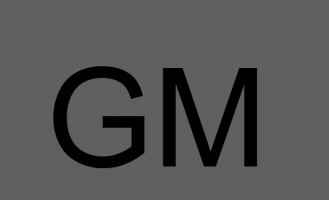
What is this? There’s no way that’s the logo, it can’t even be replicated very easily. The all black is bad enough this would be the worst thing ever created. It looks like someone took a logo and decided to bring it down to 4k.
 
watch the University come out with their press release and say something like this:

"...with this BOLD cutting-edge sans-serif look, it marks a University that is forward-thinking and open ended that is transcendent in its approach, inclusive of its past and embracing its challenges into its future and most of all represents it's diverse population that is For the World."
 

Enforcer

Specialist
Oh my -- please don't be true!! Aside from the fact that it looks bad. This would be the FINAL in their minds, vetted product. That means that multiple people went through several drafts and said "this is the winner!" lol

Yeah, any of us, or our kids can use Canva and do something better lol
 

jruby

Specialist
Oh my -- please don't be true!! Aside from the fact that it looks bad. This would be the FINAL in their minds, vetted product. That means that multiple people went through several drafts and said "this is the winner!" lol

Yeah, any of us, or our kids can use Canva and do something better lol
Haha this actually looks like something that was created in canva!
 

JPgmuswim

Starter
I like it. It's simple and looks like it was designed in the late 70s, which will give it a more timeless feel as we move forward:
360_F_475749291_fP7VwY92PJu660ec8pbn1ubUzIiWZoyR.jpg


Almost fits in stylistically with WMATA's branding, and they've been smart to never rebrand.

I also like that it's easy to doodle on stuff.

The GM logos that softball and baseball use have a nice classic feel, but this is a good upgrade to that (and hopefully we continue to use them occasionally).

It's good. You all will learn to like it because it's better than the star by miles. Strike me down in your hatred and I will become more powerful than you could possibly imagine.
I think you forgot to put your words in italics
 

By George.

Starter
I like it. It's simple and looks like it was designed in the late 70s, which will give it a more timeless feel as we move forward:
360_F_475749291_fP7VwY92PJu660ec8pbn1ubUzIiWZoyR.jpg


Almost fits in stylistically with WMATA's branding, and they've been smart to never rebrand.

I also like that it's easy to doodle on stuff.

The GM logos that softball and baseball use have a nice classic feel, but this is a good upgrade to that (and hopefully we continue to use them occasionally).

It's good. You all will learn to like it because it's better than the star by miles. Strike me down in your hatred and I will become more powerful than you could possibly imagine.
This was refreshing to read. So much whining (some will come from our account)
 

mkaufman1

Administrator
Staff member
⭐️ Donor ⭐️
GIVING DAY 2023
Not all of us wanted the star gone, and not all of us wanted Gunston gone either.

First we got "the Patriot" and now we have this. Rage inducing.
I’d say the majority of us wanted the star gone. I never saw many positive comments about it, and I was never a fan.

Gunston, I don’t think as many did but I’d defer to someone who knows that history better. That’s already 15 plus years ago at this juncture.
 

JPgmuswim

Starter
I’d say the majority of us wanted the star gone. I never saw many positive comments about it, and I was never a fan.

Gunston, I don’t think as many did but I’d defer to someone who knows that history better. That’s already 15 plus years ago at this juncture.
When I was a swimmer I almost got the shooting star tattooed on myself. Since I started in 99’ we had the old star logo then I believe my senior year we transitioned to the current star around 03-04. The fact that it had changed in the 4 years I was a swimmer was a lesson on not getting a logo that might change every few years. :ROFLMAO:
 

GMU79

All-American
⭐️ Donor ⭐️
GIVING DAY 2023
Just fold the athletics department already. Jfc this is so low effort. I'm with everyone that the star sucks, but guess what? The "GM" alternate that everyone creams themselves over also sucks. It's fine for baseball hats, bad in all other contexts.
Yes, the GM on the baseball caps are not attractive at all. Too "skinny."

Ok, I want to clear something up, because I don't think this has been stated clearly, and so everyone keeps drawing conclusions like this.

The new logo is for the entire university, not just the athletic department. Rather than having an academic logo and an athletics logo, everyone will use the same logo now.
So then everyone will suck together.

This looks like a map on a plaque of a maze you see at Mount Vernon or Monticello when approaching the grounds.

Can't wait for the Olive Garden to feature this on their kid's place mats and having 4 years olds color all over this.
I thought the same thing...Maze. Puke.

I am still holding out hope that this is a publicity stunt.
I would never, ever buy or wear anything with that logo on it.
PLEASE be right!!!

this is a PR nightmare for Mason. Shame on them for oversharing image. Clearly they wanted this to get out to see the backlash.

This should never had been the logo for the Athletics Department. There was nothing wrong with the old M and quill before.
M and Quill. My favorite.
Please give us a GMU for sports!!
 

Verdad

Starter
⭐️ Donor ⭐️
Oh my -- please don't be true!! Aside from the fact that it looks bad. This would be the FINAL in their minds, vetted product. That means that multiple people went through several drafts and said "this is the winner!" lol

Yeah, any of us, or our kids can use Canva and do something better lol
I'm going to ask my 7 year old to create a better logo in Canva this weekend - will post what he comes up with
 

emjayar08

Sixth Man
Hope that this is one of 5 logos, among an entire re-branding campaign.

One w green and gold
One that says patriots below
One that is GM with a quill tied in
One thats GM with a star in the background
One with VA state tied in
one GM just black and white

But I'm sure they made this and congratulated themselves on the back.
 
Last edited:

Patriot8

All-American
⭐️ Donor ⭐️
GIVING DAY 2023
The consistent flow of visceral hate regarding the leaked logo has triggered a slowly growing sense of compassion inside of me for the new GM design. My level of dissatisfaction has subsided a bit. Not going to act like I like it, because I do not. In fact, I doubt I will ever understand how this even became a seriously considered option, and I hope that those involved explain their thought process and ultimate decision. Having said that, I am looking forward to seeing the full roll out over the next couple of days. Hopefully my hatred can shift into some form of begrudged acceptance, with blind hope for something significantly better in the future.
 

dr. gunnie

Administrator
Staff member
The consistent flow of visceral hate regarding the leaked logo has triggered a slowly growing sense of compassion inside of me for the new GM design. My level of dissatisfaction has subsided a bit. Not going to act like I like it, because I do not. In fact, I doubt I will ever understand how this even became a seriously considered option, and I hope that those involved explain their thought process and ultimate decision. Having said that, I am looking forward to seeing the full roll out over the next couple of days. Hopefully my hatred can shift into some form of begrudged acceptance, with blind hope for something significantly better in the future.
Agreed. I think I'm going heel mode and will fully embrace the change. Love the new logo... LOVE IT!
 
Top