Feels like a university that was named for a founding father is desperate to re-brand itself as hip, modern and edgy … good luck with that, we already had something that fit the university’s image, this 70s knockoff won’t stand the test of time.Ask yourself which of these had to "grow on you" (that sounds like moss to me). The time tested ones like Xavier, Tennesee, Syracuse and other are simple, but don't have to "grown on you".
You are using an out of date browser. It may not display this or other websites correctly.
You should upgrade or use an alternative browser.
You should upgrade or use an alternative browser.
News New Mason Athletics Logo Coming Soon?
- Thread starter The Great PATSby
- Start date
Just fold the athletics department already. Jfc this is so low effort. I'm with everyone that the star sucks, but guess what? The "GM" alternate that everyone creams themselves over also sucks. It's fine for baseball hats, bad in all other contexts.
Assuming the outside line will be used as an outline, it looks more like "q m".
Even not so bright vcu fans will be able to come up with a chant using the Q.
And the "M" looks like we flatlined.
Holy shit, we are going to be known as the Dead Queens (or something similar)!

Even not so bright vcu fans will be able to come up with a chant using the Q.
And the "M" looks like we flatlined.
Holy shit, we are going to be known as the Dead Queens (or something similar)!
Just fold the athletics department already.
Ok, I want to clear something up, because I don't think this has been stated clearly, and so everyone keeps drawing conclusions like this.
The new logo is for the entire university, not just the athletic department. Rather than having an academic logo and an athletics logo, everyone will use the same logo now.
Which actually makes it worse. The academic logo was good. Now both suck.Ok, I want to clear something up, because I don't think this has been stated clearly, and so everyone keeps drawing conclusions like this.
The new logo is for the entire university, not just the athletic department. Rather than having an academic logo and an athletics logo, everyone will use the same logo now.
Oh I don't think athletics came up with it. But it's so embarrassing that I don't want to compete against other schools wearing it.Ok, I want to clear something up, because I don't think this has been stated clearly, and so everyone keeps drawing conclusions like this.
The new logo is for the entire university, not just the athletic department. Rather than having an academic logo and an athletics logo, everyone will use the same logo now.
I am going to assume when color is added it will look something like this, but hopefully I am wrong.
View attachment 2255
This looks like a map on a plaque of a maze you see at Mount Vernon or Monticello when approaching the grounds.
Can't wait for the Olive Garden to feature this on their kid's place mats and having 4 years olds color all over this.
I am still holding out hope that this is a publicity stunt.
I would never, ever buy or wear anything with that logo on it.
I would never, ever buy or wear anything with that logo on it.
p8triotfan4life
Starter
this is a PR nightmare for Mason. Shame on them for oversharing image. Clearly they wanted this to get out to see the backlash.
This should never had been the logo for the Athletics Department. There was nothing wrong with the old M and quill before.
This should never had been the logo for the Athletics Department. There was nothing wrong with the old M and quill before.
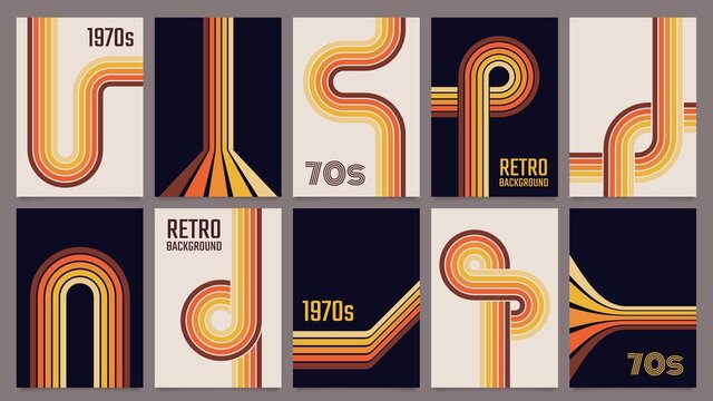
I like it. It's simple and looks like it was designed in the late 70s, which will give it a more timeless feel as we move forward:
Almost fits in stylistically with WMATA's branding, and they've been smart to never rebrand.
I also like that it's easy to doodle on stuff.
The GM logos that softball and baseball use have a nice classic feel, but this is a good upgrade to that (and hopefully we continue to use them occasionally).
It's good. You all will learn to like it because it's better than the star by miles. Strike me down in your hatred and I will become more powerful than you could possibly imagine.
I’ve spent all my hatred on the logo, none left for youI like it. It's simple and looks like it was designed in the late 70s, which will give it a more timeless feel as we move forward:
Almost fits in stylistically with WMATA's branding, and they've been smart to never rebrand.
I also like that it's easy to doodle on stuff.
The GM logos that softball and baseball use have a nice classic feel, but this is a good upgrade to that (and hopefully we continue to use them occasionally).
It's good. You all will learn to like it because it's better than the star by miles. Strike me down in your hatred and I will become more powerful than you could possibly imagine.
How does it look compared to other university logosView attachment 2256
Would like the UMBC logo but with GMU in the curve above a Patriots head like the New England Patriots logo. That would be fresh
Just the organization that Mason wants to be associated with, WMATA. Known for track fires, endless delays and incompetence.I like it. It's simple and looks like it was designed in the late 70s, which will give it a more timeless feel as we move forward:
Almost fits in stylistically with WMATA's branding, and they've been smart to never rebrand.
I also like that it's easy to doodle on stuff.
The GM logos that softball and baseball use have a nice classic feel, but this is a good upgrade to that (and hopefully we continue to use them occasionally).
It's good. You all will learn to like it because it's better than the star by miles. Strike me down in your hatred and I will become more powerful than you could possibly imagine.
You mean something like this:This looks like a map on a plaque of a maze you see at Mount Vernon or Monticello when approaching the grounds.
Can't wait for the Olive Garden to feature this on their kid's place mats and having 4 years olds color all over this.
Gonna ignore the sarcasm font here and say that branding is one thing that WMATA actually has going for it. The M metro logo is timeless.Just the organization that Mason wants to be associated with, WMATA. Known for track fires, endless delays and incompetence.
Maybe we should give WMATA the star logo?
When the shoe fits...Just the organization that Mason wants to be associated with, WMATA. Known for track fires, endless delays and incompetence.
phoenix-arizona
All-American
I don't hate it. I like the 70s/80s vibe of it.
Now we're talking the same language!Gonna ignore the sarcasm font here and say that branding is one thing that WMATA actually has going for it. The M metro logo is timeless.
Maybe we should give WMATA the star logo?
Forum statistics
#MasonNation Network
Check out these great sites:
GiantKiller.co
ByGeorge
Expat Hoops
Fourth Estate
Doc Nix and the Green Machine
Bill Bride - DMV Sports Shots
Patriot Brew Blog/Newsletter
GiantKiller.co
ByGeorge
Expat Hoops
Fourth Estate
Doc Nix and the Green Machine
Bill Bride - DMV Sports Shots
Patriot Brew Blog/Newsletter