News New Mason Athletics Logo Coming Soon?

By George.

Starter
With all the negativity throughput the launch of Mason's new logo it makes me wonder who the test group was, or, dare I say, if there even was a test group.
They spoke to 150 people, parents, students, alum and employees via zoom and also had a survey completed by 1,500 people before creating the new logo. They also hosted a viewing at the Science and Tech building (I think) a couple months ago that absolutely no one went to. There was opportunities. Did you take advantage of them?

I think the feeling was that Mason didn’t really have an identity to follow. It doesn’t really have a history to lean on. They wanted something basic that could be used by all as they’re not going to allow different programs to design their own logos anymore. They didn’t want to use the Baseball logo because they thought it would be lame to have a whole logo drop with a logo we already have.

I’m not gonna defend the logo, I understand each person will have an opinion. I won’t change that, but if you have questions about the process I’m happy to help answer or find the answer.

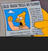
I think the one thing I’ve realized about Mason fans, and people in general as I age is that people won’t care until they’re outraged.
 
Last edited:

GSII

Hall of Famer
⭐️ Donor ⭐️
GOLD SPONSOR
GIVING DAY 2023
What better group to include in the process than the 24 year old masonhoops.com group. There is a treasure chest of guidance they could of accessed by corraling these long devoted and pretty knowledgeable posters.

Mason can't seem to get out of its own way. smh

I don't remember seeing anything about participating in the new logo process. Was it made public?
 
Last edited:

JPgmuswim

Starter
Not that I’m buying Champion gear but it looks like their TM on the new brand is significantly smaller than what we were seeing from Adidas yesterday.


dr. gunnie

Administrator
Staff member
They spoke to 150 people, parents, students, alum and employees via zoom and also had a survey completed by 1,500 people before creating the new logo. They also hosted a viewing at the Science and Tech building (I think) a couple months that absolutely no one went to. There was opportunities. Did you take advantage of them?

I think the feeling was that Mason didn’t really have an identity to follow. It doesn’t really have a history to lean on. They wanted something basic that could be used by all as they’re not going to allow different programs to design their own logos anymore. They didn’t want to use the Baseball logo because they thought it would be lame to have a whole logo drop with a logo we already have.

I’m not gonna defend the logo, I understand each person will have an opinion. I won’t change that, but if you have questions about the process I’m happy to help answer or find the answer.

I think the one thing I’ve realized about Mason fans, and people in general is that people won’t care until they’re outraged.
They should have used that for our tagline instead of "all together different"

George Mason - We Don't Care Until We're Outraged
 

mkaufman1

Administrator
Staff member
⭐️ Donor ⭐️
GIVING DAY 2023
What better group to include in the process than the 24 year old masonhoops.com group. There is a treasure chest of guidance they could of accessed by corraling these long devoted and pretty knowledgeable posters.

Mason can't seem to get out of its own way. smh

I don't remember seeing anything about participating in the new logo process. Was it made public?
I don't disagree at face value with this point- but unfortunately there's a lot of garbage mixed in with helpful feedback. Nobody is going to go digging through.

The logo process was invite only to select individuals.
 

Yossarian

Sixth Man
This is thrilling news. I have something new to complain about.
 

Attachments

  • IMG_3512.jpeg
    IMG_3512.jpeg
    817.4 KB · Views: 42

Leesburg Chankenstank III

All-American
⭐️ Donor ⭐️
I remember when Virginia Tech changed their logo in 2017. People were ready to riot with pitchforks.

Hardly anyone thinks about the logo anymore and apparel sales have never been higher.

Yes the new logo sucks but we’ll hardly be talking about it in a year. Especially if we start winning.
 

Attachments

  • IMG_2321.jpeg
    IMG_2321.jpeg
    74.3 KB · Views: 41

gmujim92

Hall of Famer
GIVING DAY 2023
I remember when Virginia Tech changed their logo in 2017. People were ready to riot with pitchforks.

Hardly anyone thinks about the logo anymore and apparel sales have never been higher.

Yes the new logo sucks but we’ll hardly be talking about it in a year. Especially if we start winning.
That’s a pretty subtle change — really just a tweak.

If VT had rolled out something like Mason did, people would have lost their jobs. It’s that bad.
 

dr. gunnie

Administrator
Staff member
What better group to include in the process than the 24 year old masonhoops.com group. There is a treasure chest of guidance they could of accessed by corraling these long devoted and pretty knowledgeable posters.

Mason can't seem to get out of its own way. smh

I don't remember seeing anything about participating in the new logo process. Was it made public?
I kind of feel like they did. Some of the feedback over the years from fans on here:

- Get rid of the star - we are the patriots, not the stars.
- Stop using different shades of green, lock down one single shade for everything
- Back when Paulsen was here we had MASON on the jersey. People complained and said we should go back to GEORGE MASON and not just MASON.
- Not all, but some said a more unified logo that correlates better with the school logo.
- Not all, but some said more of a classic look with the interlocking letters like many other universities.

I think they actually hit a lot of our wish list. It really just comes down to in my opinion picking a GM logo/font that most don't find interesting/good looking. That I can agree with. It's basic and retro looking and not aggressive or appealing at all to the eye.
 

GunstonsGhost

Preferred Walk-On
They spoke to 150 people, parents, students, alum and employees via zoom and also had a survey completed by 1,500 people before creating the new logo. They also hosted a viewing at the Science and Tech building (I think) a couple months that absolutely no one went to. There was opportunities. Did you take advantage of them?

A cheaper alternative take would have been to open up a competition to students and alumni to come up with the new logo. It's then free to the university. It also allows everyone interested to be part of the process either through voting or contributing their own design. It's also then a product of something WE created, not some design firm in Ohio. The university did very little to get us involved. That's a big part of the outrage. If we would have been INCLUDED (everyone loves that word) there would have been less "outrage".

I think the feeling was that Mason didn’t really have an identity to follow. It doesn’t really have a history to lean on.

No identity? We're named after a founding father. In my opinion the quill was already perfect. However, my time was focused on academics not athletics, so I can see how maybe it doesn't work as a sports logo, but I don't see a reason we have to throw out an already solid design for something trying to please everyone that falls flat.
 

GMU79

All-American
⭐️ Donor ⭐️
GIVING DAY 2023
I don't disagree at face value with this point- but unfortunately there's a lot of garbage mixed in with helpful feedback. Nobody is going to go digging through.

The logo process was invite only to select individuals.
That last sentence says a lot about how much they cared about fan, student, alumni input...none at all. "Let’s ask folks who all think like us what they think."

That’s a pretty subtle change — really just a tweak.

If VT had rolled out something like Mason did, people would have lost their jobs. It’s that bad.
Yeah, the new VT is actually pretty cool.
 

gmujim92

Hall of Famer
GIVING DAY 2023
No identity? We're named after a founding father. In my opinion the quill was already perfect. However, my time was focused on academics not athletics, so I can see how maybe it doesn't work as a sports logo, but I don't see a reason we have to throw out an already solid design for something trying to please everyone that falls flat.
1. Being named for a founding father is likely part of the problem, from some people’s perspective. No identity whatsoever might be preferable.

2. Can someone who understands these things better than me explain why exactly the quill M cannot be used as an athletics logo? Several people have said this, but just as a matter of fact — it’s so because it just is.

With some subtle creative tweaks, I think that could be turned into something that would look 1,000,000 times better on our gear and home court than the nondescript GM.
 

GunstonsGhost

Preferred Walk-On
2. Can someone who understands these things better than me explain why exactly the quill M cannot be used as an athletics logo? Several people have said this, but just as a matter of fact — it’s so because it just is.
To me it looks more academic. There's no reason it couldn't work as a sports logo, but an athlete with a quill just seems out of character.
 

mkaufman1

Administrator
Staff member
⭐️ Donor ⭐️
GIVING DAY 2023
That last sentence says a lot about how much they cared about fan, student, alumni input...none at all. "Let’s ask folks who all think like us what they think."
Okay - this couldn't be further from the truth here and it comes across as sour grapes and jealousy. I suspect this is venting but regardless.

They actually did get public opinion, they had a public viewing session (which nobody showed up to and @By George mentioned) and did get folks involved. They are not going to be able to solicit feedback from everyone, that's just not possible.

They didn't even solicit feedback from me, someone who is visible connected and lives 250 miles away. I'm fine with that.

We can be upset with the logo, we can be upset with the process, but lets not make it like they should have asked every single person affiliated with Mason for an opinion.
 

dr. gunnie

Administrator
Staff member
1. Being named for a founding father is likely part of the problem, from some people’s perspective. No identity whatsoever might be preferable.

2. Can someone who understands these things better than me explain why exactly the quill M cannot be used as an athletics logo? Several people have said this, but just as a matter of fact — it’s so because it just is.

With some subtle creative tweaks, I think that could be turned into something that would look 1,000,000 times better on our gear and home court than the nondescript GM.

My guess about the quill is similar to the hatred of the star. For years and year fans on here said we aren't the stars, so having a star or anything in our logo that wasn't a patriot wouldn't do. I'm guessing that might have ruled out any non-patriot symbols like a quill... and we all know we weren't getting a patriot.
 

MasonSAE4

All-American
⭐️ Donor ⭐️
Okay - this couldn't be further from the truth here and it comes across as sour grapes and jealousy. I suspect this is venting but regardless.

They actually did get public opinion, they had a public viewing session (which nobody showed up to and @By George mentioned) and did get folks involved. They are not going to be able to solicit feedback from everyone, that's just not possible.

They didn't even solicit feedback from me, someone who is visible connected and lives 250 miles away. I'm fine with that.

We can be upset with the logo, we can be upset with the process, but lets not make it like they should have asked every single person affiliated with Mason for an opinion.
The problem with these types of processes is in fact that there's too much input. Everything gets watered down when it gets run through 20 layers of review and admin. In an attempt to appeal to everyone, you appeal to no one.

This whole thing reminds me of the episode of "Community" where they attempt to redesign the school mascot to offend no one and in the end come up with a monstrosity.
 

MasonSAE4

All-American
⭐️ Donor ⭐️
1. Being named for a founding father is likely part of the problem, from some people’s perspective. No identity whatsoever might be preferable.

2. Can someone who understands these things better than me explain why exactly the quill M cannot be used as an athletics logo? Several people have said this, but just as a matter of fact — it’s so because it just is.

With some subtle creative tweaks, I think that could be turned into something that would look 1,000,000 times better on our gear and home court than the nondescript GM.
1.) Ding ding ding. Being named after a person makes branding 1000% more difficult. Especially when you're named after someone who is now basically seen as "oh yeah he was there too I guess".

2.) It's a good foundation for a logo, but it does need to be updated. It comes across as a little too academic and flat for an athletics logo, but for like 1/100th the price of what we paid for the new logo, I'm sure we could've updated it to something usable.
 

mkaufman1

Administrator
Staff member
⭐️ Donor ⭐️
GIVING DAY 2023
The problem with these types of processes is in fact that there's too much input. Everything gets watered down when it gets run through 20 layers of review and admin. In an attempt to appeal to everyone, you appeal to no one.

This whole thing reminds me of the episode of "Community" where they attempt to redesign the school mascot to offend no one and in the end come up with a monstrosity.
100% with you- that's probably one of the reasons it took 3 years.

1.) Ding ding ding. Being named after a person makes branding 1000% more difficult. Especially when you're named after someone who is now basically seen as "oh yeah he was there too I guess".

2.) It's a good foundation for a logo, but it does need to be updated. It comes across as a little too academic and flat for an athletics logo, but for like 1/100th the price of what we paid for the new logo, I'm sure we could've updated it to something usable.
Stop making too much sense! this is the internet! LOL
 
Top