News New Mason Athletics Logo Coming Soon?

GMU79

All-American
⭐️ Donor ⭐️
GIVING DAY 2023
THREE YEARS and THIS is what they came up with!?

The open ends of the letters in the new logo symbolizes the “multiple entry points and pathways to success,” according to a school release. “An interior gold shape hugged by green on both sides depicts the university’s signature diversity and inclusivity. The clean lines represent the university’s efficiency and pragmatism.”

Give me a break. I guess we're overlooking the deep symbolism and creativity of children bored at iHop.
Okay, this is TOO funny. I actually read this post while finishing breakfast with my wife at....IHOP! :ROFLMAO:
 

gmujim92

Hall of Famer
GIVING DAY 2023
Full collection: https://gomason.shop/collection

The polos and crewnecks aren't that offensive (prob because you can barely see the logo), but anything that uses a larger "GM" is completely ruined by the gigantic trademark stamp.

I'm going to hold out hope that this logo grows on me and they come out with some better gear (lol) prior to next basketball season.
The fact that they felt compelled to put the words George Mason under the logo on the polos means it’s a sh!tyy logo that can’t stand on its own.

The only thing to do with this gear rollout is boycott.
 

JPgmuswim

Starter
Like some of those sweatshirts, when the new logo is in the larger format I hate it. Wonder if they’ll rollout new basketball jerseys using only the logo on the chest. :rolleyes:
 

Verdad

Starter
⭐️ Donor ⭐️
Like some of those sweatshirts, when the new logo is in the larger format I hate it. Wonder if they’ll rollout new basketball jerseys using only the logo on the chest. :rolleyes:
Holy shit - I just realized this is going to be on ALL of the teams uniforms - the right emoji doesn't exist for this emotion. How many 100,000's of dollars has been sent on this - just think of the new courts, fields, signs, uniforms, etc. that are going to be changed, on top of whatever they spent on the consultants/designers.

They should bring back the cricket stadium to distract everyone from this.

I'm going to respond to all future donation solicitation emails with "I don't trust you with my money"
 

gmujim92

Hall of Famer
GIVING DAY 2023
Now I’m praying Mason doesn’t decide to bring the collective fully in-house. Sadly, it’s probably running better and more efficiently with volunteers — and we’ve just seen how easily they can burn through money for a D- product.
 
Mason Hoops making me proud. All statements above are so true., especially the accountability one. Was this the same group that came up with "Commanders"?

Time to run out to Walmart and stock up on the old logo stuff cuz I won't be wearing any of this.

I think this is called 70's Disco font. The late 70's were a great time to be at Mason, but I doubt anyone involved in the selection of this horrible logo was around then.

1714057758043.png
1714057857789.png
1714057899511.png
 

Patriot Lawdog

Starter
⭐️ Donor ⭐️
This is what happens when you try to be all things to all people. D level results. All of us understand this because we don't work in academia. The real world demands more than just a word salad of explanations.
What I do take pride in is the fact that the funniest and most witty critiques of the new logo are all from Mason fans themselves. We can identify our own flaws just fine, we don't need all these other dingbats chiming in.
 

gmujim92

Hall of Famer
GIVING DAY 2023
This is what happens when you try to be all things to all people. D level results. All of us understand this because we don't work in academia. The real world demands more than just a word salad of explanations.
The quill M is by far Mason’s best logo IMHO. It’s unique and immediately recognizable — and why it couldn’t be used for both academics and athletics is beyond me. (Not comparing us to Stanford by any means lol, but the well-known S with the inset tree works for both — it can be done).

Unfortunately in the year 2024, the fact that George Mason wrote the Virginia Bill of Rights is but an inconvenient footnote to be easily swept aside.
 

GMU79

All-American
⭐️ Donor ⭐️
GIVING DAY 2023
The quill M is by far Mason’s best logo IMHO. It’s unique and immediately recognizable — and why it couldn’t be used for both academics and athletics is beyond me. (Not comparing us to Stanford by any means lol, but the well-known S with the inset tree works for both — it can be done).

Unfortunately in the year 2024, the fact that George Mason wrote the Virginia Bill of Rights is but an inconvenient footnote to be easily swept aside.
If I can find any quill stuff, I'm buying it today!
 

emjayar08

Sixth Man
How is it just one logo? No alternate logo to support athletics? Nothing related to the quill, VA bill of rights, VA in general, anything that gives the branding a sense of identity??

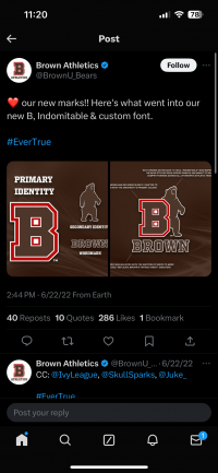
Our new AD supported a more thorough rebrand effort at Brown, even if it's not much better.

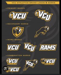
vcu's re-brand: also not the best, but they did a great job creating lots of variations. Its not just “vcu”!

Mason literally made a 5 minute logo and called it a day!
 

Attachments

  • IMG_8249.png
    IMG_8249.png
    781.5 KB · Views: 31
  • IMG_8251.jpeg
    IMG_8251.jpeg
    742.6 KB · Views: 28
Last edited:
Top