Also, not for nothing but they very easily could’ve tweaked the existing logo to add the G next to the M. Can’t think of any reason why the letters necessarily have to be connected.If I can find any quill stuff, I'm buying it today!
You are using an out of date browser. It may not display this or other websites correctly.
You should upgrade or use an alternative browser.
You should upgrade or use an alternative browser.
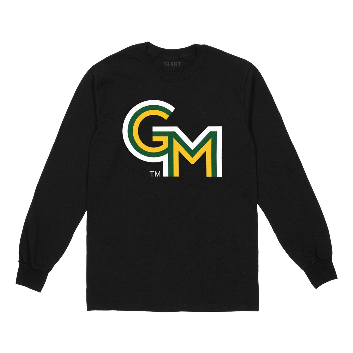
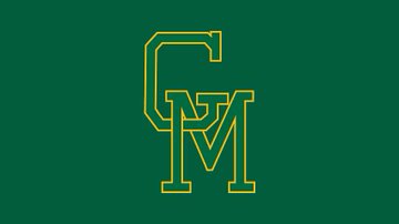
News New George Mason Logo
- Thread starter The Great PATSby
- Start date
Sincerely not getting political, but I think a big part of the problem is the administration wants Mason to have an identity that frankly does not exist.How is it just one logo? No alternate logo to support athletics? Nothing related to the quill, VA bill of rights, VA in general, anything that gives the branding a sense of identity??
Our new AD supported a more thorough rebrand effort at Brown, even if it's not much better.
The university was named for a founding father, not a billionaire tech bro.
So based on this I shouldn't be thinking "well hopefully we will only have one official green moving forward..."They broke their own brand/logo guidelines on the launch. Nothing is more Mason that that.
View: https://twitter.com/RealBrianDunbar/status/1783511682775495136
View: https://twitter.com/RealBrianDunbar/status/1783513870256021913
How is it just one logo? No alternate logo to support athletics? Nothing related to the quill, VA bill of rights, VA in general, anything that gives the branding a sense of identity??
Our new AD supported a more thorough rebrand effort at Brown, even if it's not much better.
vcu's re-brand: also not the best, but they did a great job creating lots of variations. Its not just “vcu”!
Mason literally made a 5 minute logo and called it a day!
Disagree here. Speaking as a "brand enforcer" during my career, many variations is a cardinal sin when building brand identity and image. Variations dilute the brand. The goal is to build solid recognition. Multiple variations promote a schizophrenic brand. One would see a variation in one context and another variation in another context and confusion is the likely result. In that respect, one will never be able to fully grasp the values for which the logo, and hence the organization, stands. The fewer the "variations" the better.
Last edited:
I don't disagree with you, but they already crossed that rubicon...Disagree here. Speaking as a "brand enforcer" during my career, many variations is a cardinal sin of brand-building. Variations dilute the brand. The goal is to build solid recognition. Multiple variations promote a schizophrenic brand. One would see a variation in one context and another variation in another context. In that respect, one will never be able to fully grasp the values for which the logo, and hence the organization, stands. The fewer the "variations" the better.

I don't disagree with you, but they already crossed that rubicon...
Unfortunately, I already saw that and I'm absolutely mortified. I can NEVER un-see it!
GunstonsGhost
Starter
The term "Patriots" is probably on the way out as well. Likely offends someoneHow does PATRIOTS fit in here?

Should have just done MASON with the right font and color
The script Patriots was not retired - that will stay. So, I guess you could consider that an alternate logo.How is it just one logo? No alternate logo to support athletics? Nothing related to the quill, VA bill of rights, VA in general, anything that gives the branding a sense of identity??
Our new AD supported a more thorough rebrand effort at Brown, even if it's not much better.
vcu's re-brand: also not the best, but they did a great job creating lots of variations. Its not just “vcu”!
Mason literally made a 5 minute logo and called it a day!
Also, the Patriot was updated:

we are going to get sued by Central MichiganThis could be the old Catholic Ministries logo. Maybe Ft. Bob let the school use it.
PDGL Hoops
Starter
Do not like.
I hope I misunderstood, but, was told that the baseball logo will remain as a legacy option. If I got that correct, that defeats half the goal here.
George Mason University Brand Portal
Interestingly, the baseball logo is not on the list of retired marks. I guess I heard that correctly.
This is the one that is not on the list:
This guy needs a complete do over.The script Patriots was not retired - that will stay. So, I guess you could consider that an alternate logo.
Also, the Patriot was updated:
The reality of the situation — and this might be a good thing — is any student entering Mason in the Fall will have no knowledge of the history of Mason's logo nor will they give a sh-t. My son started at Mason a few years ago and loaded up on apparel in the bookstore. He never once questioned or cared what the logo was. My daughter is a freshman at Virginia Tech, and just buys whatever they offer as well.
I am not a fan of the new logo, but I also know that the people on these boards and the vocal people on social media are a very small minority who see this as a problem. Most alumni and even current students — I'd venture in high 90 percentile — couldn't care less about the old or new logo. Apathy, in this case, is our friend.
I'm not trying to change anyone's mind or discourage people from venting. I'm just saying it is what it is and that it will be a complete non-issue in a few months.
True, but I still need to vent for awhile.The reality of the situation — and this might be a good thing — is any student entering Mason in the Fall will have no knowledge of the history of Mason's logo nor will they give a sh-t. My son started at Mason a few years ago and loaded up on apparel in the bookstore. He never once questioned or cared what the logo was. My daughter is a freshman at Virginia Tech, and just buys whatever they offer as well.
I am not a fan of the new logo, but I also know that the people on these boards and the vocal people on social media are a very small minority who see this as a problem. Most alumni and even current students — I'd venture in high 90 percentile — couldn't care less about the old or new logo. Apathy, in this case, is our friend.
I'm not trying to change anyone's mind or discourage people from venting. I'm just saying it is what it is and that it will be a complete non-issue in a few months.
Top Donors
-
 Patriotsince81$250.00
 -
 GSII$100.00
 -
 Old Man$100.00
 -
hoopsjunkie75$50.00
-
 GMU1983$50.00
Forum statistics
#MasonNation Network
Check out these great sites:
GiantKiller.co
ByGeorge
Expat Hoops
Fourth Estate
Doc Nix and the Green Machine
Bill Bride - DMV Sports Shots
Patriot Brew Blog/Newsletter
GiantKiller.co
ByGeorge
Expat Hoops
Fourth Estate
Doc Nix and the Green Machine
Bill Bride - DMV Sports Shots
Patriot Brew Blog/Newsletter