
New Court Design

ArtVandalay

Four-star Recruit
Changes to the court design for this year. Paulsen just tweeted this out.

The key is no longer green, the logo looks bigger, and all the lines on the court are green. I like it.
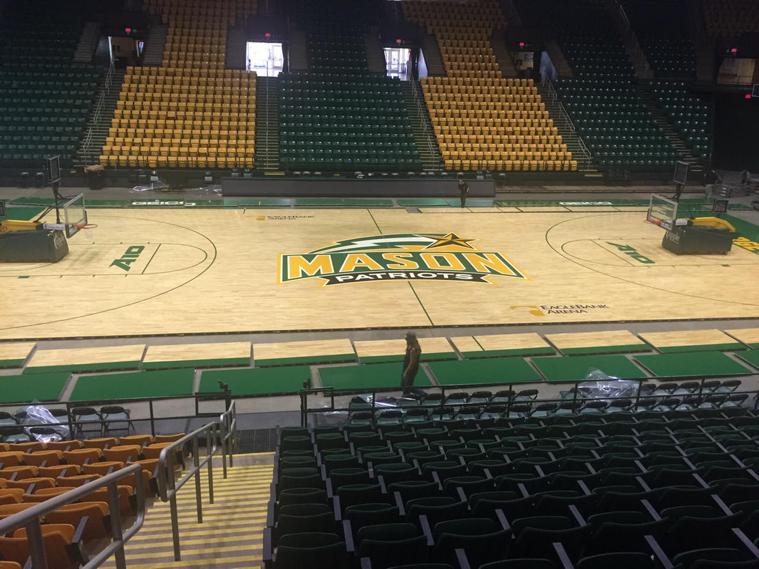
CS-40EjWcAARIIN.jpg:large
 
Last edited:
S

Steve33

Spectator
looks amazing, cant wait till next friday to see it in person.
 
G

gmu05

Spectator
Good to see we aren't using those Eaglebank dollars on floor paint.
 

JBiggs

Starter
Looks good. I think it would have been cool to paint the interior of the arc green and leave the lane clean like that (I always like that look), but this looks nice.
 

99 Patriot

Starter
GIVING DAY 2023
Pretty sure this is a brand new floor/playing surface, not just a facelift of the old one. Good investment in my opinion as the old one was starting to wear down with some dead spots and wear to it.
 

JBiggs

Starter
Pretty sure this is a brand new floor/playing surface, not just a facelift of the old one. Good investment in my opinion as the old one was starting to wear down with some dead spots and wear to it.
Good to hear. I always noticed the gaps between the panels in the old floor, and it drove me crazy. I didn't see it in the pictures of the new design, so I was curious if it was a new floor.
 
L

liem.le.3388

Spectator
The new speaker system looks pretty sleek also and you can understand what is being said!
 
S

S-money

Spectator
While I am personally against the enlargement of center court logos, at least this isn't like Kansas or Texas A&M which are hideous. Rest of it looks good.
 
W

wijg

Spectator
I like it! I think the logo is a good size. Big enough to see it on TV easily, but not overwhelming.
 
V

Vurbel

Spectator
Plenty of room for us to put "Coach Larranaga Court" on it.
 
Last edited by a moderator:
P

PoorManProfit

Spectator
They got rid of creepy announcer guy too, right?
 
Top