You are using an out of date browser. It may not display this or other websites correctly.
You should upgrade or use an alternative browser.
You should upgrade or use an alternative browser.
News New George Mason Logo
- Thread starter The Great PATSby
- Start date
OP
- Thread Starter
- #622
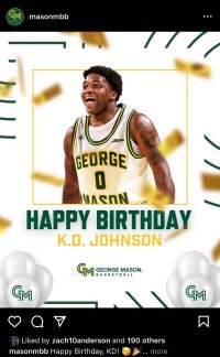
Logo still hasn’t grown on me. after seeing this posted on X today, I hate it even more.
That’s a terrible graphic, but made worse with new logo on a dark background. Should definitely use the reverse color version in this situation

OP
- Thread Starter
- #624
That’s a terrible graphic, but made worse with new logo on a dark background. Should definitely use the reverse color version in this situation
The fact that someone has to choose between two color variations of the logo is a reason this logo sucks. Anyone outside of Mason won't know there are two variations. Even most Mason students and alumni probably wont even realize there are two variations. Guaranteed the logo is going to be used in the less appealing color variation all the time like the recruit did and the A10 did in the graphic posted serveral posts above.
Last edited:
CHRISTOPHER JAMES JOLLAY
Hall of Famer
That’s a terrible graphic, but made worse with new logo on a dark background. Should definitely use the reverse color version in this situation
View attachment 2349
Gunnie, quit the shtick. Dude in the right light with some photoshopping I look like Ryan Gosling
This isn't that 2-face girl in Seinfeld that looks good sometimes this is an abomination and I'd appreciate as always if somebody set themselves on fire to send Mason a powerful message
Old guys here you have the least life left just saying
OP
- Thread Starter
- #627
I read somewhere that the founder and CEO of the small design firm that Mason hired to create this abomination was proud that she was "a C student" in college.
Hire underachievers, get an uninspiring logo.
This is Ologie's logo. This should have been a red flag right from the start.
Ologie....what an abomination for a business name.
Their contact us form.... https://ologie.com/contact/
Let the hate flow.
Their contact us form.... https://ologie.com/contact/
Let the hate flow.
Last edited by a moderator:
Honestly, I think the dislike and disgust of the branding would be better directed towards the powers that be at GMU.Ologie....what an abomination for a business name.
Their contact us form.... https://ologie.com/contact/
Let the hate flow.
Funny that they boast that they have worked with "over 250 clients across all types of education," and show logos of some of the colleges they have worked with, but Geo Mas, which they designed in full, is not on their page.Ologie....what an abomination for a business name.
Their contact us form.... https://ologie.com/contact/
Let the hate flow.
Do even they know that the logo isn't their best work?
On another note, my sources tell me that their Creative Director is considering trying out for the position and likeness of our future mascot:
OP
- Thread Starter
- #631
DON’T DO IT FORDHAM!!!

What damage could they do to their logo with initials like "FU"??

What damage could they do to their logo with initials like "FU"??
Yes! Do it, do it. Let us NOT suffer alone!
That would be awesome. But could Ologie meld the F and U together in a way that it seems natural? They couldn't for us.What damage could they do to their logo with initials like "FU"??
My bet is that Fordham’s logo will come out better than ours.
I’m curious - were any of us on these message boards included in the focus groups? I’d love to ask what that was like and hear what the general comments were at the time.
I’m curious - were any of us on these message boards included in the focus groups? I’d love to ask what that was like and hear what the general comments were at the time.
I’m curious - were any of us on these message boards included in the focus groups? I’d love to ask what that was like and hear what the general comments were at the time.
I participated in a zoom meeting with a few others on here back in January. While we never saw any possible new logos, I recall a lot of the discussion was around the old logo and how/why it didn't really connect with a lot of us. I do remember discussion about how having a school logo and an athletics logo that intertwined would be nice instead of two that were totally unrelated. At one point there was some talk about the old GM logo and how people liked it/prefered it over the star logo. Really, the gist of it was nobody had a connection with the star logo.
p8triotfan4life
Starter
My bet is that Fordham’s logo will come out better than ours.
I’m curious - were any of us on these message boards included in the focus groups? I’d love to ask what that was like and hear what the general comments were at the time.
this is why the school won't increase any revenue because of the new blah logo.
if I were to change the logo, the primary reason would be for revenue. they failed in all regards other than to add their new tagline to be altogether different. they missed. and failed. and should be held to that standard of failure.
Top Donors
-
 Patriotsince81$250.00
 -
 GSII$100.00
 -
 Old Man$100.00
 -
hoopsjunkie75$50.00
-
 GMU1983$50.00
Forum statistics
#MasonNation Network
Check out these great sites:
GiantKiller.co
ByGeorge
Expat Hoops
Fourth Estate
Doc Nix and the Green Machine
Bill Bride - DMV Sports Shots
Patriot Brew Blog/Newsletter
GiantKiller.co
ByGeorge
Expat Hoops
Fourth Estate
Doc Nix and the Green Machine
Bill Bride - DMV Sports Shots
Patriot Brew Blog/Newsletter