Quentin Daniels
Hall of Famer
I think they’d change their minds fast after the first game. The helmet would make it more difficult to shoot. Not to mention the shoulder pads.The players would want to wear those every home game
I think they’d change their minds fast after the first game. The helmet would make it more difficult to shoot. Not to mention the shoulder pads.The players would want to wear those every home game
This one
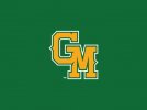
Is that the one the baseball team uses? Or one very similar?Finally found a hat with that logo on it. Had to actually go to the bookstore to get it (4,000+ mile trip for me) since it's not available online, but at least they had it. I still think this should be our primary logo.
It's similar...I like the one they use as well:Is that the one the baseball team uses? Or one very similar?
I agree 100%! Full size caps make my head look stupid too.It's similar...I like the one they use as well:
View attachment 1132
The GM logo hat I bought wasn't shaped like a real baseball hat...it's the lower profile design that is fully adjustable in the back. On field style baseball hats make my head look stupid, but that's beside the point.
The main point is the GM logo is good in any form and we should be using it instead of the shooting star.
Menacing .... menacing ... oh no, we can't have that! It might scare the children! And quite a few adults, too, of more recent vintage.I agree 100%! Full size caps make my head look stupid too.
AND, yes, get rid of the star and use the GM. I also like the quill M.
I also think an menacing patriot logo would look good.
Riley Trone..... now that's a blast from the past.Current roster - Oduro. However, I would be more likely to purchase a George Evans throwback jersey. Or maybe Nate Langley, Riley Trone or Craig Hodges.
If he can pull me from the darkest depths of "I'll never donate to the program again" to being fully committed again, I would hope he has convinced everyone to come back into the fold.Damn, CKE does everything right. He is daring me to start donating again. And I will now.
Gray. ;-)Question for the masses - let's say jerseys became available and you could get any player on the roster, who would you get? Kind of hard with all the turnover and new faces.
My "no donation" protest was not about basketball, but with the overall direction of the university. Even then, I still donated to IHS but not through the GMU Foundation.If he can pull me from the darkest depths of "I'll never donate to the program again" to being fully committed again, I would hope he has convinced everyone to come back into the fold.
Hope not.New Green Machine Unis - they will have 4 options.
I wonder if any of these will mirror any of the new basketball team's unis?
View attachment 1133
I like the Pollock Splatter looking one. They should do that with the basketball jerseys too (at least the home whites).
They way the did the logo too reminds me of the USFL New Jersey Generals.
Damn you might be older than me.Riley Trone..... now that's a blast from the past.
Gunston face maybe?Menacing .... menacing ... oh no, we can't have that! It might scare the children! And quite a few adults, too, of more recent vintage.