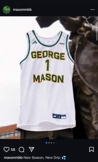
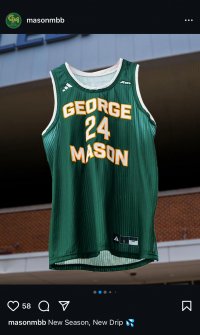
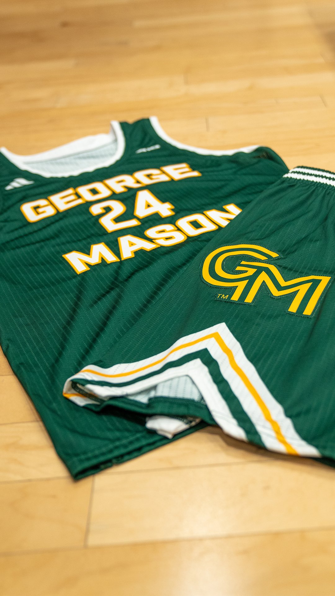
New Mason uniforms

Mason Trooper

Four-star Recruit
Since signing with Adidas back in 2015 , mason basketball has had new uniforms every two years up until last year. Don’t get me wrong I love the retro look that was implemented back in 2021, im just wondering if anyone has an inside scoop of any new potential uniforms ?
 

The Great PATSby

All-Conference
⭐️ Donor ⭐️
I got the inside scoop when they realeased the logo last week.

415a270b-6cb9-4f7b-8472-40e30b856dc6.png
 
OP
M

Mason Trooper

Four-star Recruit
Since signing with Adidas back in 2015 , mason basketball has had new uniforms every two years up until last year. Don’t get me wrong I love the retro look that was implemented back in 2021, im just wondering if anyone has an inside scoop of any new potential uniforms ?
 

Attachments

  • IMG_1545.jpeg
    IMG_1545.jpeg
    841.3 KB · Views: 59
  • IMG_1546.jpeg
    IMG_1546.jpeg
    900.8 KB · Views: 69

emjayar08

Sixth Man
Ooph. Looks like a jersey from 1992.

The piping/stripes on the shorts clash with the GM logo so much.

I guess they think ultra simple is cool now, but this isn’t it.

The Re-brand was a neutering.
 
OP
M

Mason Trooper

Four-star Recruit
Ooph. Looks like a jersey from 1992.

The piping/stripes on the shorts clash with the GM logo so much.

I guess they think ultra simple is cool now, but this isn’t it.

The Re-brand was a neutering.
I wonder if a yellow jersey will be brought back or a black jersey with yellow in it … the away jersey lacks yellow and looks too simple (almost like a practice jersey)
 

The Great PATSby

All-Conference
⭐️ Donor ⭐️
I like the tops. The General Motors logo on the side is obnoxiously too big and in an awkward spot on the side. Even though I hate the logo, putting it at the bottom corner at a smaller size like previous years would have been more aesthetically pleasing.

Also even though its not an approved color variant, it could look better if the inside of "GM" was White to match the Lettering and Numbers.


GXm010UXQAAuX2X
 
Last edited:

gmujim92

Hall of Famer
GIVING DAY 2023
I wonder if a yellow jersey will be brought back or a black jersey with yellow in it … the away jersey lacks yellow and looks too simple (almost like a practice jersey)
Both kinda look like practice jerseys honestly. Not sure why they needed to go away from the last set, which to my eye were pretty well perfect — change for change’s sake, probably.
 

mkaufman1

Administrator
Staff member
⭐️ Donor ⭐️
GIVING DAY 2023
Both kinda look like practice jerseys honestly. Not sure why they needed to go away from the last set, which to my eye were pretty well perfect — change for change’s sake, probably.
While I like the jerseys, I agree they look like practice jerseys. I wonder if these are some sort of markup and not final.
 

gmujim92

Hall of Famer
GIVING DAY 2023
I like the tops. The General Motors logo on the side is obnoxiously too big and in an awkward spot on the side. Even though I hate the logo, putting it at the bottom corner at a smaller size like previous years would have been more aesthetically pleasing.

Also even though its not an approved color variant, it could look better if the inside of "GM" was White to match the Lettering and Numbers.


GXm010UXQAAuX2X
Also is it just my failing eyesight (possible), or does the gold in the logo not match the gold in the jersey?
 

Walter

Hall of Famer
⭐️ Donor ⭐️
GOLD SPONSOR
Are we back to dark kelly green? I hate that.

But, I like the "GEORGE" being straight instead of curved.
 

jruby

Specialist
Actually really don't mind them. Maybe was expecting something even worse and have come to expectations of awful after the logo. They have set the bar low.......
 

Verdad

Starter
⭐️ Donor ⭐️
I like them, I like the clean look. Glad the CM is relegated to the side of the shorts, was afraid of it being featured on the chest (which I think would have been in line with their logo instructions - right?)
 
Top